Nova: AI That Fleets Actually Talk To
Element Fleet Management, the largest publicly traded fleet management company had an AI assistant nobody used.
Some users never noticed the button. The ones who did got walls of text back and gave up, finishing the task manually instead because it felt faster than waiting and reading.
In two weeks, my team redesigned it from the ground up. Adoption went up 8%. Stock analysts covering Element cited it as a reason to be bullish on the company.

2 weeks
2026
2 PMs, 2 Developers
Lead designer
The Problem
Ordering is Element's platform for fleets to order and configure vehicles. It had an AI assistant built into it already but almost nobody used it. We looked at the usage data and talked to users directly, and found two separate problems stacked on top of each other. Some people simply didn't see the entry point; it was positioned somewhere their eyes never landed. The people who did find it got long blocks of text back, and decided reading through it was slower than just doing the task manually.
Principles Before Pixels
Before sketching a single screen, I wrote down what this had to be, based on who was actually using it. Fleet managers are task-focused. They want to finish the job, not have a conversation. So the assistant had to be non-intrusive, show up only when needed, and communicate by showing rather than explaining. Every concept after this point got measured against these principles, not against what looked good.
Exploring the Shape of the Thing
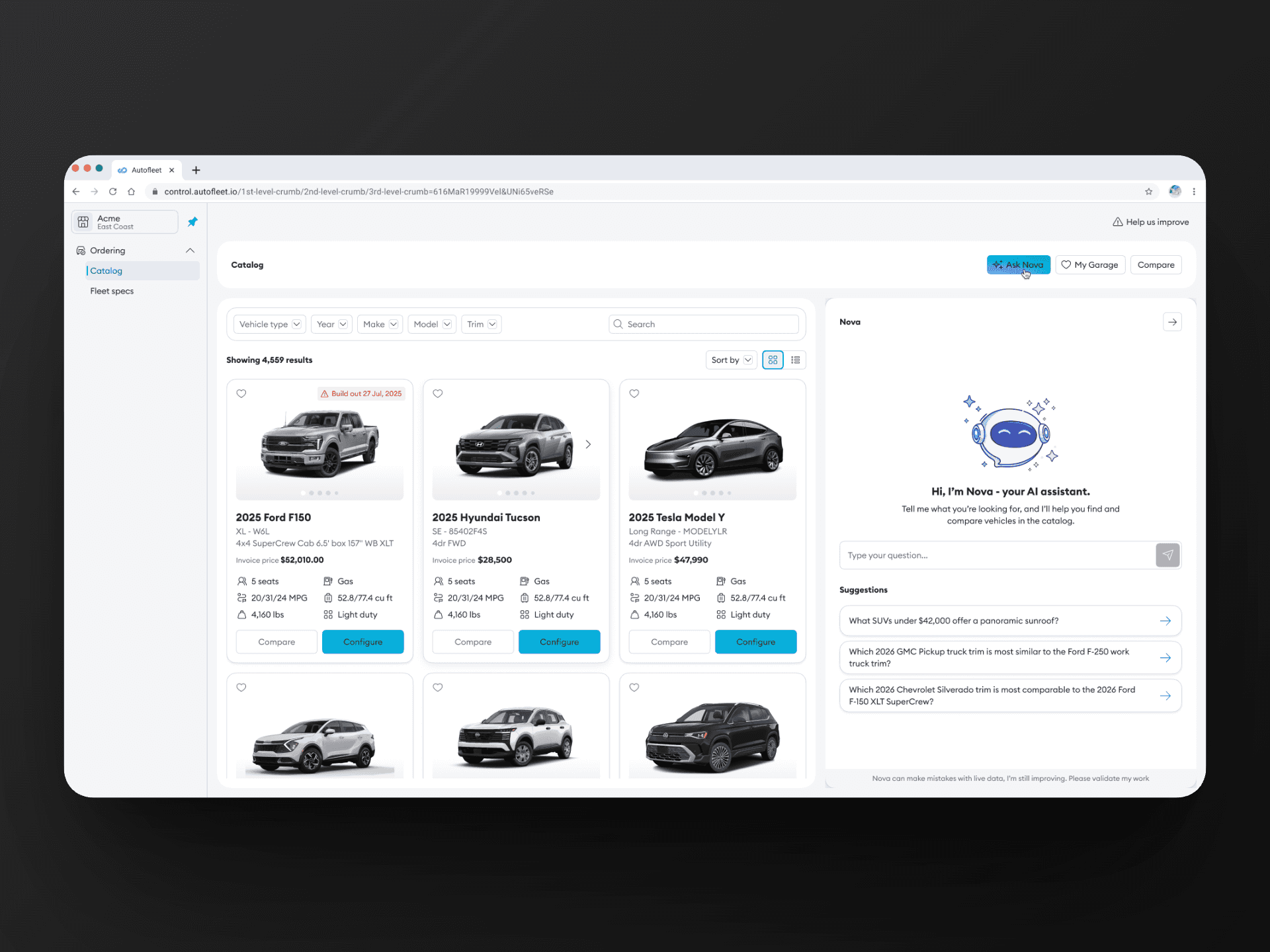
I looked at how other platforms were handling AI assistants - modals, full-page takeovers, side panels, inline responses. I then prototyped several button placements and visual treatments to see what would actually get noticed without being obnoxious about it. The goal wasn't novelty. It was finding the version that fit how someone using Ordering already worked, not a version that made the AI feel like the main event. This aligned more with the side panel concept since it felt more like an add-on.


Getting the Org to Agree, and Pushing Back When It Mattered

Shipping in Two Weeks, With Real Trade-Offs
The whole project - from concept to launch, took two weeks. That meant no formal user testing before release. We made calls based on the research we already had and the principles we'd set, and accepted the risk that came with skipping validation. It wasn't the ideal way to ship something user-facing, but the business timeline didn't leave room for anything slower.
What Happened
8%
Improved adoption
Adoption of the assistant increased 8% after launch. More than the number itself, the reception told us the principles had worked. Users engaged with it as the quick, low-friction tool we'd designed it to be, not another thing competing for their attention. It became visible enough, in fact, that stock analysts covering Element referenced it directly as a signal the company was accelerating digitally - a rare instance of a design decision showing up in financial commentary about the business.

“This feels super hacky. I've been using it for everything these days. Just wish it was integrated with the compare and fleet spec capabilities though. ”

Ray
Fleet manager | American Red Cross
The Story Didn't Stop at Launch
Once Nova was live and being used, new problems showed up at scale that hadn't been visible before. Its answers were still too text-heavy for people trying to scan and compare vehicles quickly, and the chat had no way to act on a result directly - no “add to garage,” no “compare,” just more text. Multi-step tasks, like searching and then immediately comparing, forced people to restart instead of flowing naturally from one to the next.
The next phase of work turned Nova from a conversation into an interface: vehicle results now render as visual cards instead of paragraphs, comparisons appear as structured tables instead of prose, and every result carries direct actions - save to garage, add to compare, configure. Instead of leaving the user to figure out what to do with an answer. We set new principles for this phase too: reasoning has to fit in two to three lines before showing results, the conversation state persists no matter how someone navigates, and the system is upfront about its limits; capping comparisons at four vehicles and results at six, rather than overwhelming the user with everything at once.
What I'd Do Differently
Skipping user testing to hit the two-week timeline worked out this time, but it was a bet, not a strategy. Some of the friction we found later : the text-heavy outputs, the functional dead ends - might have surfaced earlier with even a lightweight round of testing before launch. I'd fight harder for three extra days next time, even under pressure, because the cost of finding these problems after launch was higher than the cost of finding them before.