Redesigning Whatfix's Product Suite

3 months on final design
2024
1 PM, 1 EM, 12 Engineers
Lead designer
What Whatfix Is
Whatfix is a Digital Adoption Platform (DAP) - a software that other enterprise companies embed into their own products to guide users through workflows in real time. Instead of static help docs, it layers in-app walkthroughs, tooltips, pop-ups, and beacons directly on top of a company's existing product, so a new hire learning Salesforce or a customer navigating a CRM gets contextual help exactly when they're stuck, without leaving the screen.
The Problem
Whatfix shipped two products for the same job - Studio, an extension for creating content, and Dashboard, a web app for managing it. Both were on separate codebases, with different interaction patterns for nearly everything.
Why It Was Broken by Design
Studio and Dashboard had grown up separately - different form factors, different teams, no shared source of truth. Authors had to learn both, features built for one rarely made it to the other, and every new capability got coded twice. Whatfix even ran two separate university courses to teach people how to edit the same kind of content in two different ways.
Even if I patched pieces of it as a side project and tried to ship, it would never be implemented: no engineering team actually owned Studio and Dashboard together, so there was nowhere for the fix to land. I built a case for it. The duplicated build cost, the feature-parity gaps, the fact that Whatfix ran two separate university courses to teach the same editing task twice and pitched it to the CTO, CPO, and every product and design lead in the room. Leadership agreed to stand up a new team to execute it: the twelve engineers I ended up working with existed because of that pitch, not before it.


What the Data Actually Said
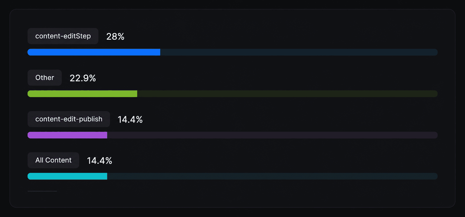
Contextual inquiry with content authors surfaced confusion nobody had named yet "see live," "preview," and "launch live edit" all sounded like the same thing, and most people couldn't explain the difference. The clearer signal was quantitative: over 80% of users clicked straight to edit on landing, while fewer than 2% ever touched the slideshow arrows the page was built around. An entire view was dead weight.
One Pattern, Nine Kinds of Content
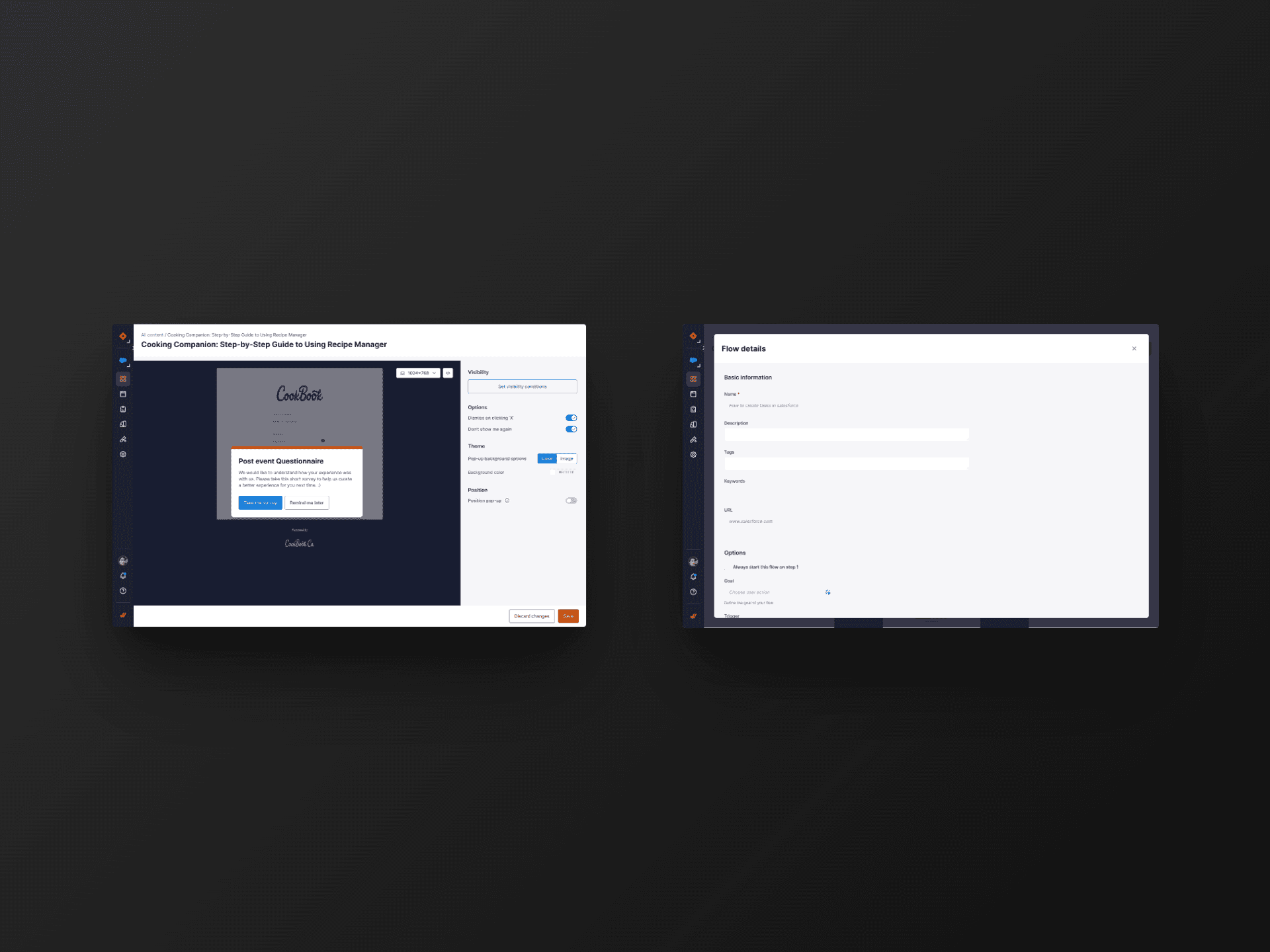
Studio and Dashboard didn't just need to agree on layout. They had to hold flows, links, videos, and articles alongside beacons, smart-tips, popups, launchers, and surveys, each with a different data shape, inside one consistent editing pattern.
I concept-tested the merged view multiple times before it held up: authors expected to edit screenshots directly, expected a form to appear on first click, and found saving after every single step painful whenever the app ran slow. When the timeline later forced a scope cut, I ran the remaining features through a MoSCoW pass and retested the trimmed set specifically to confirm it still delivered the value we'd promised, rather than assuming a smaller scope meant a smaller win.
What Shipped
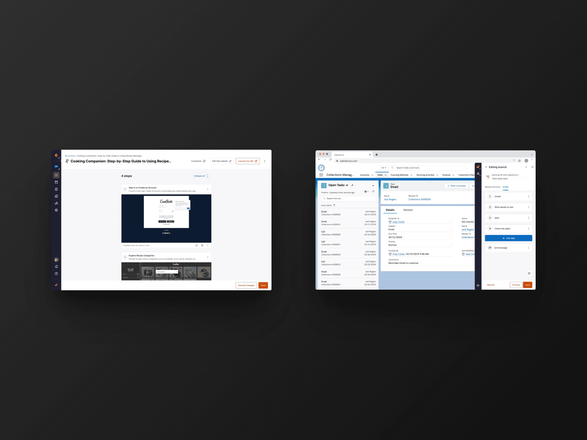
I merged the slideshow and edit views into one scannable card list, brought Studio's in-context editing into Dashboard, and standardized CTA placement across both. Along the way I found most authors were working on Windows with meaningfully less usable screen space than the Mac-based mockups assumed, so the layout shifted to an adaptive pattern instead of forcing Studio's mobile-like back-and-forth navigation onto a full desktop canvas.

What Happened
100%
Adoption by different teams in first quarter
21%
Improvement in SUS(System Usability Score)
27.3s
Reduction in flow creation time
What I'd Do Differently
Getting the team stood up took most of my energy, and it should have but it meant the save-pattern change (killing Studio's cross-tab save in favor of per-step saves, so engineering could finally platformize the codebase) got less scrutiny before it shipped than the rest of the redesign did. It was the right call. I made it faster than I made the others.